
GroupMe App Case Study: Customizing Notifications
Overview
Role
Product Designer
Timeline
3 months (September to November 2019)
Team
Independent Project
Skills
Product Thinking, User Research, Interaction Design, Visual Design, Prototyping
Tools
Figma, Sketch
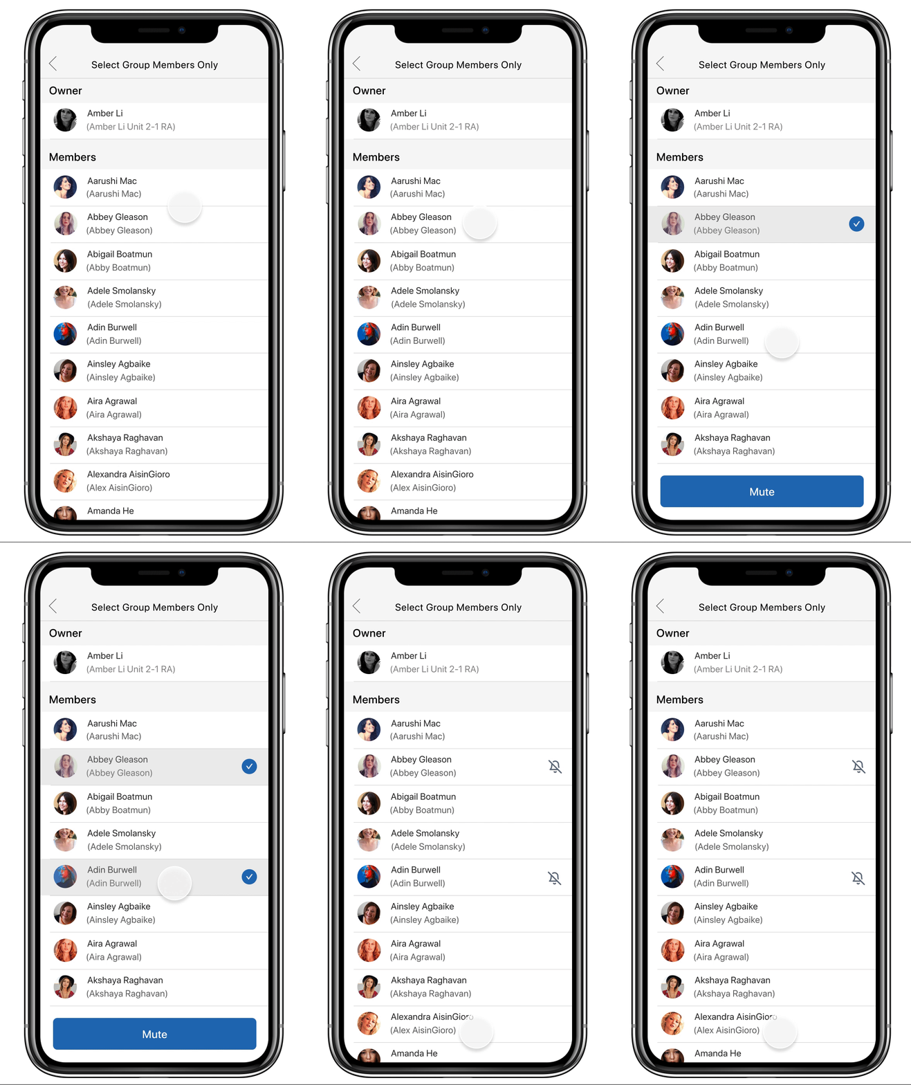
Final Prototype


✨ Introduction
Like many other college students, GroupMe is a staple messaging app on my phone. I am a member of numerous group chats including chats for my dorm floor, the fashion magazine I’m a part of on campus, and for class homework help. With so many users on this lightweight interface, I first looked at where GroupMe does its job of easy group text messaging well:
✅ GroupMe is operating system agnostic, making it convenient both iOS and Android users.
✅ You can contact people quickly and directly within the app without needing access to their phone number, which is great for group communication.
✅ Despite a UI that isn’t as visually appealing as other apps like Facebook Messenger, network effects keep users like myself on the app.
These features allow groups to form easily on GroupMe. However, this multitude of group chats, many of them with a large number of members(I’m in a free food group chat with more than 500 other Cornell students), leads to an influx of messages that aren’t meaningful to the user.
In this case study, I explored filtering for meaningful information on GroupMe through a customized notifications feature.
🕵🏻♀️ Defining the Problem Space
GroupMe’s messaging system makes it easy to send information to groups. However, large group chats mean a large number of messages. Most users are in these group chats to receive important information but end up receiving spam. My initial hypothesis was that there must be a way to make interactions and messages more meaningful.
How do we make interactions more meaningful on GroupMe?
Research
Users
On GroupMe, there are two main users in group chats:
- The Group Organizer: They usually start a groupchat and is the leader of the group. They often send announcements, polls, and other information through the group.
- The Everyday User: They are usually a member of multiple groups to receive information rather than send messages. They may send the occasional message to ask a question or reply to someone.
My goal was to learn about how different users interact with their group messages on GroupMe and how they handle important information by answering these questions:
- How do people find information in group chats?
- How do they feel about current group chat messaging?
- How do people respond to GroupMe notifications?
After conducting ten 1:1 interviews and receiving form survey feedback, here are some key insights:
- Everyday Users receive too many irrelevant messages in big group chats.
- Everyday Users and Group Organizers can’t sort for important information in their groups.
- Some users muted group chats but found that they missed important information:
I can’t stand spam notifications so I mute my group chats. But then I never end up looking at the group chat and miss important information.
The Revised People Problem
My initial hypothesis was on the wrong path. Rather than looking at how to make messages and interactions more meaningful, I shifted to looking at how to filter for important information…
When people use GroupMe, they want to receive messages that contain important information, but they can’t do that well because there is no way to filter important information within group chats.
Currently, the only ways to filter for messages from group chats are to find the most popular messages or most liked messages under Group Info. To filter for incoming messages, your only option is the mute the groupchat indefinitely.
💡 Filtering for Meaningful Information
Brainstorming
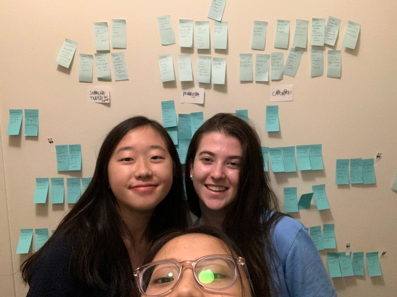

I recruited my friends Sarah and Emma as my two brainstorming buddies. After brainstorming How Might We’s and narrowing down the solution space, I focused on three possible features:
1. Pinned Messages

- Pinned messages is highly feasible as it builds upon messages and elements already within the app. It allows users to filter for important information by creating hierarchy.
- However, it does not address the issue of receiving irrelevant messages and pinning multiple messages at a time can easily become crowded.
2. Categorized Messages

- Categorized messages would allow users to organize their messages more easily.
- However, it is not as feasible since there are engineering constraints to filter through messages. It also does not address the issue of receiving irrelevant messages.
3. Customized Notifications

Ultimately, I went with the Customized Notifications feature with high feasibility and high impact. This feature is highly feasible since it builds upon GroupMe’s existing information architecture and settings, and it is high impact since it would allow users to customize their influx of messages, filtering for important information.
How can we utilize notification settings to notify users of the information that is most important to them?
💬 Implementing Custom Notifications
The Market — How Other Products Customize Notification Settings
First, I investigated how other products implement customized notifications. Customized notification settings carry similar content across platforms: muting conversations entirely, muting for a certain amount of time, and filtering to mute certain messages only.

After looking at some inspiration, I was ready to start sketching.
Initial Approach


Content
Users were frustrated because they received too much spam from large group chats. After sketching out some of my ideas, I identified several key feature requirements for the feature:
- Muting notifications for a certain amount of time.
- Enabling/disabling notifications from mentions.
- Enabling/disabling notifications from the group owner only.
- Enabling/disabling notifications from select group members only.
Finding an Entry Point
Option A: A “Receive Notifications” page that would replace the current “Mute” toggle under the group info page.
Option B: Muting certain members through the existing “Members” page under the group info page.
I went with Option A, a more concise entry point that could consolidate all the customized settings under one navigation point. Option B is less intuitive and could be confusing with the settings already linked to “Members” such as viewing someone’s profile and direct messaging someone.
After determining an entry point, I identified the information hierarchy that would lead to my feature. I wanted the feature to be intuitive and well-seen on the app.
Determining Information Hierarchy

Medium-Fidelity Explorations
After identifying the entry point and user flow, I started putting the pieces together in Figma through medium-fidelity explorations.
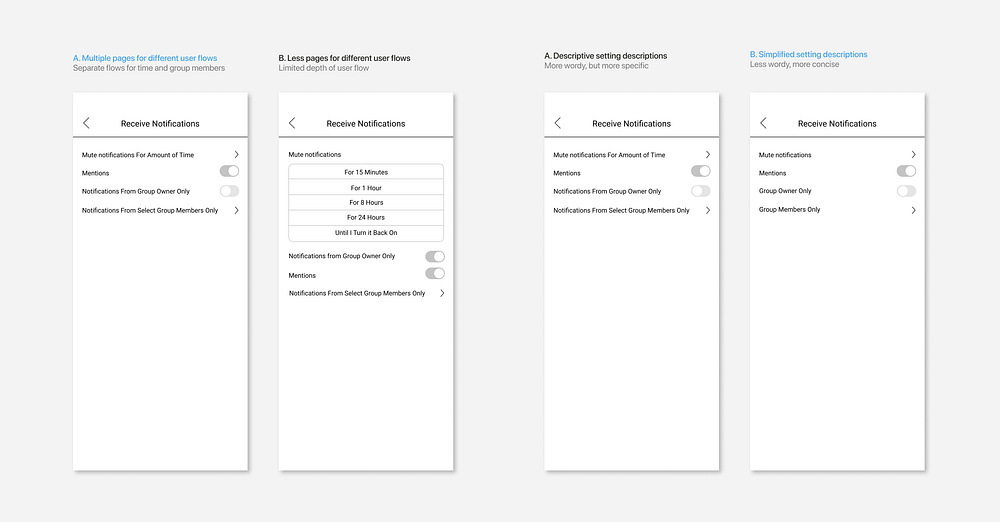
The first important consideration was the content organization under “Receive Notifications.” Option A included multiple user flows to different pages, identified by a karat. Option B consolidated more of the information on the page, only leaving the “Group Members” user flow to multiple pages. I went with A because it was more continuous with GroupMe’s current interface that includes multiple user flows identified by karats.
2. Enabling/disabling notifications from select group members.
I came up with two different ideas for this setting:
- Toggles, chosen because they are consistent with the UI of GroupMe and are a universal way to indicate enabling and disabling.
- A checkmark selection and a mute button, chosen because clicking content is a universal way to choose items for action. The mute button would make the action of muting clearer.

After asking several users to choose between the two options during user testing, it was clear that the toggles filled up the screen and made it cluttered. It was also difficult to view feedback of which group members were muted since the toggles meshed together. I went with Option B, the selection and mute button. On B, the feedback is displayed more prominently and the mute action is clearer.
Crafting the Visuals
- Mute notifications pop-up

I went with A: GroupMe’s current interface does not have pop-ups that appear in the center of the screen like B or C. Option A is also operating system agnostic, unlike C which is the iOS default pop-up. Additionally, the use of red in the cancel button ties in the red accent color of GroupMe’s UI. I wanted to choose the most consistent design with GroupMe’s current UI to encourage engagement and consistency in the feature.
2. Group Members Icons and Feedback
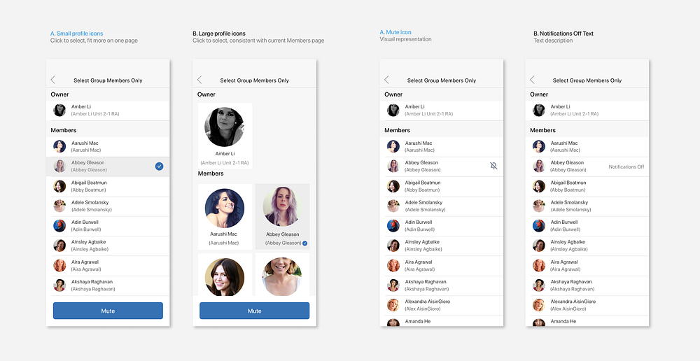
Although the current Members page has large profile icons, I went with the A, the smaller profile icons. Since this feature is most impactful for large group chats, this would enable more members to be viewed at once.
When deciding on which type of feedback would be most aesthetically pleasing and impactful, I chose A, the mute icon instead of the display text to keep it as simple and intuitive as possible. It also reduces the number of edge cases by allowing room for as much text as possible with longer names. This is the same bell icon used to identify the “Receive Notifications” feature under the group info page.
Design System

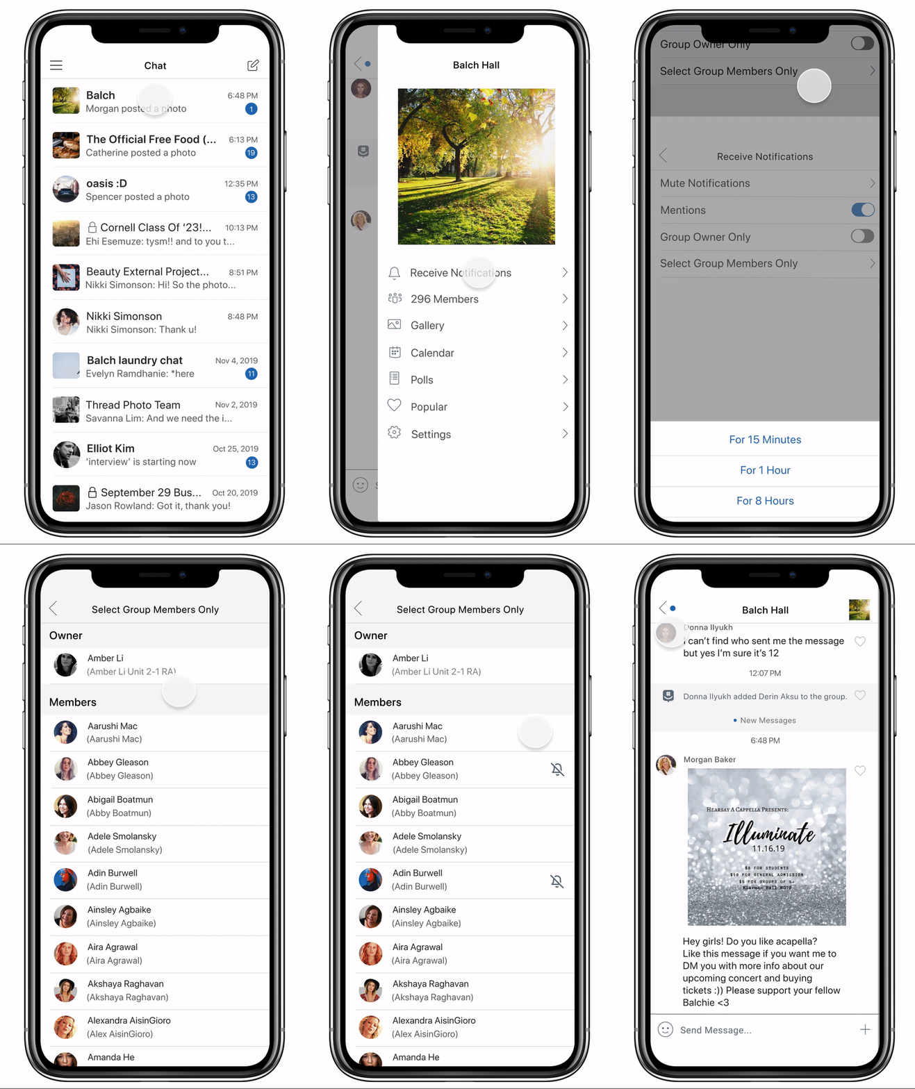
Final Interaction
After user testing with 5 users and receiving feedback that the feature was straightforward and impactful, I put together the final interaction and prototype.

✨ Looking Forward and Takeaways
GroupMe is a great system-agnostic platform for interacting with people in groups. However, for a platform used by many groups to facilitate information, people are less likely to receive the information they need when many group chats are filled with spam. GroupMe needs to be more effective for groups. Customized notifications mean you can focus on meaningful moments like your dream client meeting, a friend’s birthday, or your brother’s baby announcement without unnecessary noise.
Since this case study, GroupMe has implemented a feature that allows users to mute notifications for a certain amount of time.
This was my first full-length case study, the product of 3 months of time and effort. Over the course of this project, I deep dived into all aspects of the design process from research to the final prototype. I came into product design with a visual arts background, excited to delve into creating perfect pixels. However, I learned that I loved the product thinking process of research and brainstorming. This process showed me how my skills were a perfect fit for design — I love empathizing with users, exploring different possible solutions, as well as focusing on the visual details. I can’t wait to delve into more design projects!
Amanda He is a student studying Information Science and UX at Cornell University. This is her first UX case study.
💌 Inbox: ayh29@cornell.edu
🎨 Portfolio: https://www.amandahe.com/
